The key difference between intaglio and relief printing is how they place ink.
Intaglio pushes ink into carved or etched grooves and uses high pressure to pull it back onto damp paper, creating deep, fine detail with a tactile plate mark.
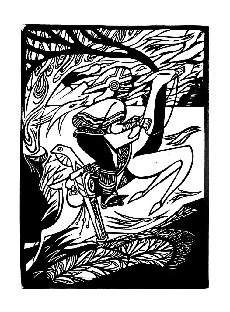
In contrast, in relief printing the ink is on the raised surfaces of a block or plate, transferring it directly to dry paper in bold, graphic strokes. Intaglio rewards patience and microscopic precision. Relief thrives on speed and high-contrast imagery.
Your choice on which type of printing should you choose depends on the following factors:
| Choose Intaglio If… | Choose Relief If… |
| You want extreme fine-line detail and tonal depth. | You want bold shapes, strong contrast, and fast output. |
| You enjoy slow, meticulous processes. | You prefer spontaneous, direct carving and inking. |
| You’re printing luxury editions or fine art. | You’re making posters, bold art prints, or high-volume runs. |
| You don’t mind damp paper, high pressure, and chemical processes. | You want minimal setup, dry paper, and no toxic chemicals. |
| You want the tactile “plate mark” collectors love. | You want visible, graphic tool marks as part of the style. |
However, that’s scratching the surface. Keep reading if you want to know more.
Table of Contents
Historical Context
When I first started digging into the roots of printmaking, I assumed intaglio and relief were just “different tools for the same job.” I couldn’t have been more wrong. The two methods grew up in almost entirely separate worlds, and you can still feel those histories every time you pull a print.
Relief Printing: The Oldest Kid on the Block
Relief printing is basically where the whole story of printed images begins. You and I owe our mass-produced books, political posters, and even those bold Japanese woodblock prints to this method.
The concept is as old as it gets. It begins with carving away what you don’t want and rolling ink on the raised bits, and print.
When Gutenberg brought movable type into the mix in the 15th century, relief printing exploded. Relief printing was more of a backbone of communication, rather than a true art form.
Governments, merchants, and anyone with a message relied on it. Over the centuries, it evolved into everything from broadside posters to the punk zines of the 1970s.
What’s wild is that this utilitarian past still shapes how people see relief work today. It’s often perceived as more “graphic” and “direct” with bold lines and high contrast.
That’s not because it can’t be subtle, but because history has trained our eyes to expect it.
Intaglio Printing: Born for Luxury and Detail
Intaglio, on the other hand, didn’t start in the marketplace.It started in the workshop of artists and engravers during the Renaissance.
The first time I saw a genuine 16th-century intaglio print under glass, I couldn’t believe the precision. The lines were so fine they felt like whispers frozen in metal.
This technique was never about speed; it was about status and permanence. Nobles, collectors, and later, entire governments adopted it because of its security and detail.
That’s why even today, your passport, your currency, and high-value certificates are born from intaglio plates.
The luxury DNA is hard to ignore. Walk into any print fair and you’ll see how the art market still treats intaglio prints as “high craft” pieces. The process carries a built-in prestige, whether you want it or not.
How History Still Shapes Perception Today
These origin stories matter because they still influence how your work is received. If you hand someone a relief print, their brain might file it next to posters, flyers, or illustrations. Give them an intaglio print, and suddenly the conversation turns to detail, security, and fine art.
When I first started selling my own work, I noticed people would pick up my relief prints with curiosity, but they handled my intaglio prints like antiques. Same person, same table, same day, yet centuries of perception playing out in real time.
Understanding that bias means you and I can use it strategically. Play into it when it helps you sell, or subvert it when you want to surprise your audience. Either way, the past is always in the room with us when we print.
Core Difference — Ink Placement and Paper Interaction
When you strip away all the romance, the tradition, and the craftsmanship, the beating heart of the difference between intaglio and relief printing comes down to one deceptively simple thing: where the ink sits before it hits the paper.
Intaglio: Ink Lives Below the Surface
In intaglio, the ink is tucked deep into the grooves, scratches, and etched lines you’ve cut into your plate. I always think of it like a secret on which you have to work to reveal it. You push the ink in, you wipe the surface clean, and what’s left is hidden in the recesses.
Then comes the press. The roller bears down with a ton of pressure, and the dampened paper gets forced into those grooves, pulling the ink back out.
The result? Lines so fine they could almost disappear, subtle gradients you could get lost in, and that unmistakable plate mark embossing the edges.
If you’ve ever run your fingers over an intaglio print, you know the feeling I’m talking about. You feel the slight dip where the ink sits, like the paper remembers the plate’s every line.
Relief: Ink Lives on the Surface
Relief printing flips this completely. Here, the ink sits proudly on the raised parts of your block or plate, waiting to kiss the paper. When you roll that ink on, it’s all about coating the surface evenly. The carved-away areas stay bare, acting as the negative space.
You don’t need damp paper. You don’t need the kind of crushing pressure intaglio demands. A good hand-burnished rub or a pass through a press is enough to transfer that ink directly. The resulting lines are bolder, the edges often crisper, and the whole image feels more “on top” of the paper rather than embedded within it.
Why This Difference Matters More Than You Think
At first, this difference in ink placement seems purely technical. But once you start working, you realize it changes everything. You can feel how the image feels under your fingertips to how it survives over time.
In intaglio, because the ink is actually sitting in the paper fibers, it often holds up better against fading and surface wear. In relief, since the ink sits on top, it can be more vulnerable to abrasion. But it also pops harder under direct light.
When I show students macro shots of both methods under raking light, their jaws usually drop. Intaglio looks like the paper itself has been sculpted. Relief looks like the paper is wearing an ink skin.
Once you see it, you can’t unsee it. You start designing differently depending on which side of the printing fence you’re on.
Tools and Materials Compared
When you first get into printmaking, both intaglio and relief can look like they just require “a plate, some ink, and something to press with.” But the deeper you go, the more you realize the tools aren’t just different.
The tools shape your workflow, your costs, and even how your body feels after a day in the studio.
Plates and Blocks
Intaglio: I still remember when I picked my first copper plate. It was heavy, smooth, and just begging to be scratched. Copper is the classic choice because it can take ridiculously fine lines and stand up to multiple print runs. Zinc is a bit cheaper but wears faster, and then there’s steel for the hardcore printers who want insane durability.
Each plate material changes the feel under your burin or needle. Copper has this buttery resistance that makes you want to keep carving. Steel, on the other hand, is like fighting a stubborn old safe where you have to earn every line.
Relief: Here, you have got wood, linoleum, MDF, even synthetic blocks. I love linoleum for beginners because it’s softer and forgiving, but nothing beats the crisp detail of a good cherry woodblock. Wood brings its own grain into the design, which can either be a gift or a headache depending on your vision.
The cost difference is huge. A relief block can be just a few dollars, while a polished copper plate can feel like buying jewelry for your studio.
Cutting and Marking Tools
Intaglio: This is where you start collecting specialized toys. Burins, etching needles, mezzotint rockers. Each one of them gives a different kind of line or texture.
And then there’s the acid bath if you’re etching, which means you also need proper ventilation, safety gear, and enough patience to watch metal dissolve at its own pace.
Relief: Instead of scratching into metal, you’re carving away chunks of material. U-gouges and V-gouges are your bread and butter here. The tools are cheaper and easier to replace, but they also dull faster. Carving for hours will work muscles you didn’t even know you had in your forearms.
Inks and Their Behavior
I’ve ruined enough prints to know that the ink you use in intaglio and relief isn’t just “the same stuff in different colors.”
Intaglio inks are oil-based and stiffer, so they can stay put in those deep grooves during wiping. They’re slower to dry and take more effort to work into the plate, but the payoff is in that rich, velvety coverage.
Relief inks can be oil or water-based, and they’re usually looser in consistency for smoother rolling. You want them to sit evenly on the surface without clogging the carved areas.
And there’s something most beginners don’t realize. Switching ink types between methods isn’t as simple as “why not?” The viscosity, drying time, and even pigment load will behave differently depending on whether the ink is going into grooves or sitting on top.
Presses and Printing Surfaces
Intaglio: You’re looking at a heavy-duty etching press, the kind you could probably use to flatten steel if you had to. They’re expensive, they take up space, and they demand precision in pressure. But without that force, your paper won’t get deep enough into the plate to pick up all the detail.
Relief: You can print relief on an etching press too (with some adjustments). But you can also go handheld with barens, wooden spoons, even the heel of your palm in a pinch. This flexibility makes relief far more portable and beginner-friendly.
Workspace Requirements
This is where a lot of people make their decision without realizing it.
Intaglio demands space, ventilation (especially for etching), a press, and the willingness to deal with messier inking and cleanup. It’s a commitment.
Relief printing is leaner. You could set up a linocut workspace on a kitchen table, clean up in ten minutes, and be done.
Plate/Block Preparation: From Blank to Matrix
This is the stage where you turn a plain slab of material into something capable of carrying your vision. A single careless move can bake a flaw into every print you pull afterward.
I’ve been there. You spot the mistake only after the first run, and by then it’s permanent. The plate or block becomes a reminder of the day you rushed.
Surface Prep: Your Foundation Matters
Relief: In relief printing, your block isn’t just a blank canvas, it’s a personality you’re about to carve into. Wood has grain, and that grain will either dance with your design or fight it every step of the way. Ignore it, and you’ll get chipping, ragged lines, and uneven ink transfer.
Cutting depth is another silent killer. Too shallow, and the ink will bridge over into your “empty” areas. Too deep, and the thin walls between your cuts can crumble, leaving gaps you never planned for.
I’ve learned to run my fingers over the carved areas before inking. If I feel a weakness in the structure, I fix it now rather than regret it later.
Intaglio: Here’s where metal feels both luxurious and unforgiving. Beveling the plate edges isn’t just a neat finishing touch. It’s a necessity. Skip it and the sharp edges can cut into your paper or damage your blankets during the press run.
Grounding (if you’re etching) is its own art; an uneven ground means the acid will bite deeper in some places, causing unwanted tonal shifts.
Polishing is the sleeper step most beginners neglect. Any scratch, no matter how faint, will hold ink. I’ve pulled “finished” prints only to find mysterious ghost lines running through them, courtesy of grit I didn’t see when I started. Once they’re there, they’re there for good.
Mistakes at This Stage Are Forever
Here’s the part most tutorials gloss over: you can’t fix certain preparation errors without starting over.
In relief, an accidental gouge in a key area means redesigning on the fly or living with a scar. In intaglio, an over-polished section might lose the ability to hold ink, creating bald spots you’ll fight through every print.
This is why I slow down at this stage, even if I’m itching to get to the “fun” part. A clean, intentional surface is like a well-tuned instrument that makes every step after smoother, more predictable, and more satisfying.
The Printing Process — Step-by-Step Contrast
This is where the real muscle memory kicks in. You can read about printing all day, but until your hands have gone through the motions, you don’t feel the difference between intaglio and relief. For me, these differences live in my body as much as in my head.
Intaglio: The Deep Work of Inking and Wiping
With intaglio, you’re not just putting ink on a surface. You are forcing it down into every line, groove, and pit you’ve created.
I use a card or dauber to work it in, sometimes in multiple passes, until the plate feels loaded but not sloppy.
Then comes the wipe, which is its own discipline. It’s not just “remove the excess ink.” It’s balancing clean highlights with rich darks, deciding how much tone you want in your open areas, and making peace with the fact that no two wipes are exactly the same.
The first time I realized I’d left just enough plate tone to give the print a moody atmosphere, it felt like I’d discovered a cheat code.
Finally, the press. Damp paper is essential here because it softens the fibers, letting them push deep into the plate’s recesses. High pressure is non-negotiable; you’re sculpting paper into metal, and it takes force. When you peel that sheet back, the print has depth you can feel with your fingertips.
Relief: The Direct Hit of Roll-Up and Transfer
Relief printing is more of a surface conversation. You roll ink over the raised areas only, and every pass with the brayer changes the personality of the print. Too much ink and you lose detail, too little and the image feels starved.
You work on dry paper here, with pressure ranging from hand burnishing to a light press run. The ink sits on the paper rather than in it. So it reveals itself with crisper edges, higher contrast, and a flatness that can be striking in its own right.
The Tactile Psychology: Wiping vs. Rolling
Here’s what almost nobody talks about: wiping and rolling don’t just produce different results, they feel different to the artist in ways that can influence the work itself.
When I’m wiping an intaglio plate, it’s meditative. It slows me down. My hands are constantly judging pressure, speed, and direction. I’m coaxing the image out of the plate like a secret. That slowness often makes me think more deeply about the mood and subtlety of the piece.
When I’m rolling ink for relief, it’s more like quick, rhythmic, and energizing drumming. The process makes me bolder, more graphic, less concerned with microscopic nuance. I’m thinking in shapes and impact, not whispers and shadows.
These psychological shifts matter. They can change the kind of work you produce, even if you don’t notice it happening at the time. And once you’ve felt both, you start choosing the method not just for the look, but for the headspace it puts you in.
Line Quality & Detail Potential
The moment you put a loupe — or even just a strong magnifier — over a print, the true DNA of the method jumps out. This is where intaglio and relief split into entirely different species.
Intaglio: Precision in the Shadows
With intaglio, you can chase lines so fine they almost disappear to the naked eye. I’ve pulled hairline engravings that only reveal themselves when the paper catches light at a certain angle. That’s not magic. The truth is that it’s the way ink settles deep into the plate’s microscopic valleys.
Aquatint takes it further, letting you create tonal gradations that feel like soft shading in a graphite drawing. A well-bitten aquatint can shift from barely-there haze to deep velvet black without ever breaking the illusion of smoothness.
And when you layer in cross-hatching, you get depth that almost tricks the brain into thinking the image is carved in relief instead of printed flat.
I’ve done pieces where cross-hatching wasn’t just a detail. It was structured.
Up close, you see an orchestra of lines playing against each other, each holding a tiny bead of ink. Under a loupe, it’s a miniature world.
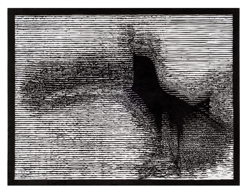
Relief: The Bold Truth of the Cut
Relief lines have their own swagger. They’re confident, unapologetic, and often thicker than anything intaglio can pull off cleanly. Tool marks aren’t mistakes, they’re signatures.
I’ve left chisel chatter in a block on purpose because it gave the print a raw, almost woodsy authority that perfectly fit the subject.
With relief, contrast is king. You don’t get the same whispery tones as intaglio, but you do get an impact that reads from across the room. The edges are crisp, the shapes command attention, and the negative space becomes as important as the marks themselves.
The Loupe Test
Here’s my personal quick-draw method for telling them apart: grab a loupe and zoom in.
- Intaglio under magnification looks like a topographic map. You’ll see ink settled in tiny valleys, subtle plate tone, and maybe even faint wipe marks where the ink thinned just slightly.
- Relief under magnification looks like a skyline. The ink sits on the surface, hugging the raised areas like a skin. You might spot slight feathering at the edges where the paper texture met the ink.
The loupe doesn’t just reveal how the image was made. In fact, it reveals the personality of the artist’s hand. Whether it’s the obsessive control of an intaglio plate or the fearless chop of a relief block, the details don’t lie.
Texture & Tactility
This is the part that makes collectors lean in, tilt the print in their hands, and run a fingertip over the surface like they’re reading braille. The way a print feels isn’t just a byproduct. It’s a part of the experience, and it’s wildly different between intaglio and relief.
Intaglio: The Plate Mark Signature
When you pull an intaglio print, the press doesn’t just transfer ink. It leaves its calling card.
The heavy pressure pushes the plate edges deep into the damp paper, creating that subtle, rectangular indentation known as the plate mark. To me, it’s like a fingerprint of authenticity. No two presses, no two papers, no two runs will make it exactly the same.
Collectors often associate a pronounced plate mark with “real” intaglio work.
But there’s a catch. If you overdo your pressure or fail to bevel properly, the mark can cut too deep, creating a shadow groove that distracts from the image. Done right, though, it’s an understated frame that tells the story of the plate’s physical presence.
Run your fingers over it, and you’ll feel a shift from the flat of the paper to the gentle dip where the plate sat. That tactile change is something digital prints can’t fake.
Relief: Emboss Without the Bite
Relief printing also has its own tactile language. Because the ink sits on the raised surfaces of the block, the paper gets a soft compression wherever those raised lines or shapes press down. It’s subtler than an intaglio plate mark but still there if you know what to look for.
In heavier relief work, especially on thicker and softer paper, you can feel the shape of the carved forms just beneath your fingers. It’s a puff of pressure, not a bite, like a gentle handshake instead of a firm grip.
Lighting Changes Everything
Here’s what many people miss out. The lighting angles change the way a print’s depth is perceived.
Under soft, diffused light, the plate mark or relief compression blends into the paper’s surface. You can see it, but it’s quiet.
Tilt the print toward a side light, and suddenly the shadows kick in. Plate marks pop, embossed lines rise, and the whole print feels sculptural.
I’ve had collectors fall in love with a piece only after I shifted it under a lamp and let the raked light catch those tiny rises and dips.
But to be honest It’s not just about touch. It’s about seducing the eye into seeing more than a flat image.
If you understand how your print behaves under different lighting, you can present it in a way that makes the tactility impossible to ignore. And that, in my experience, is often the difference between someone appreciating your work and someone needing to own it.
Color Handling
Color is where printing stops being mechanical and starts feeling like alchemy. Both intaglio and relief can create beautiful palettes, but the way you get there couldn’t be more different.
Not to mention, the headaches that you get from handling the colors are also different.
Intaglio: The Multi-Plate Balancing Act
In intaglio, each color usually means a separate plate. That means precise registration, which is lining up those plates so the image doesn’t ghost or blur, is both an art and a gamble.
On damp paper, even a hairline shift can make the whole thing look off. I’ve had days where my third plate undid the magic of the first two.
The reward? Transparency.
Intaglio’s thin ink films can layer like watercolors, letting colors breathe through each other.
Under the right hand, you can build depth and nuance. This is especially true if you control viscosity by adjusting the ink’s thickness so one plate can carry multiple colors without smudging.
Relief: Simple, But Not Simpler
Relief’s block registration is far easier with jigs or pins. It involves reduction printing by carving away each new layer on the same block. That’s great for bold, graphic work, but the opacity of most relief inks makes subtle layering tricky.
You can cheat it with a transparent base extender, but it rarely gets the same luminous quality as an intaglio glaze. Relief excels in sharp-edged color shapes, not whisper-thin gradients.
The Ignored Edge
In intaglio, when you embrace transparency instead of fighting it, you can create optical blends that feel like they’re glowing from within the paper. Relief’s strength is impact. Intaglio’s is seduction. Knowing which you’re after makes all the difference.
Paper Choices & Their Impact
Choose the wrong paper, and no amount of skill with plate or block will save you.
Intaglio: The Damp Rag Paper Non-Negotiable
For intaglio, damp rag papers are the lifeline. The high pressure of the press needs fibers soft enough to sink deep into the grooves, pulling the ink out cleanly. Too dry, and you’ll get patchy inking and broken lines. Too cheap, and the surface will tear before you even lift the blankets.
I’ve ruined a plate’s crisp detail because I tried to save time by skipping the soak. The paper didn’t fit fully into the lines, so the print looked ghostly. And once you’ve bitten into a plate too often to “make up” for bad pulls, you start wearing down its life.
Relief: Freedom, but Not a Free Pass
Relief is more forgiving. You can use dry paper without worrying about fiber compression, and that opens the door to more varieties like washi and thick cotton stock.
But the thing that most people miss is the grain direction still matters. Cut against it, and you might lose sharpness in fine lines.
The Overlooked Killer
The wrong paper doesn’t just ruin prints, it can shorten plate life. In intaglio, a paper that’s too abrasive will wear down fine etched lines faster than you think.
I once watched a gorgeous mezzotint lose its velvety tone halfway through an edition because the paper surface was microscopically sanding it away.
Good paper isn’t a luxury here. Its preservation, detail, and integrity rolled into one choice.
Cost Differences
Printing isn’t just an art, it’s a budget line that keeps demanding attention. The costs for intaglio and relief don’t just differ, they hit your wallet in very different ways.
Intaglio: Heavy on the Front End, Tricky Over Time
Intaglio starts with expensive hardware. A decent etching press can set you back thousands, and that’s before plates, tools, and the blankets that cushion every pull. Copper and zinc plates aren’t cheap, and if you work big, they get expensive fast.
Then there’s the long game: blankets wear out, and good ones aren’t bargain-bin items. Tool sharpening is a regular need, especially if you’re engraving. Add in acids, grounds, and plate-polishing supplies, and your “one-time” setup starts to look like a subscription.
Relief: Lower Start, Manageable Upkeep
Relief can feel like a bargain by comparison. You can start with a modest press or even a hand burnisher, and blocks made from linoleum or wood. .They are generally cheaper than metal plates. Brayers last a long time if cared for, and most inks are interchangeable between projects.
But don’t get too smug. Large-format blocks add up, high-quality carving tools aren’t throwaways, and tool sharpening is just as essential here.
The Hidden Money Drains
Here’s what most people don’t tell you. In intaglio, blanket replacement over a few years can quietly eclipse the cost of a new set of plates. In relief, worn-out gouges or chipped blades can ruin a block beyond repair, forcing you to start over.
The real cost isn’t just the stuff you buy but it’s how often you have to replace it to keep quality high. Skimp there, and you’ll pay double in lost prints.
Differences in Artistic Personality Fit
Choosing between intaglio and relief isn’t just about cost, tools, or process. It’s about your temperament, your creative instincts, and what kind of relationship you want with your craft.
I’ve seen artists master one and utterly fail in the other, not because of talent, but because the mindset didn’t match the method.
Intaglio: For the Patient Precisionist
If you’re the type who thrives on methodical ritual, intaglio will feel like home. Every stage such as the beveling a plate edge, laying the ground, cross-hatching under magnification needs slow, deliberate work. Mistakes aren’t quick fixes here. They’re lessons you carry into the next plate.
The printmaker Eleanor Schmidt., who I met at a residency in Florence, began her career in relief printing. She loved the boldness of woodcuts but hated the “looseness” she felt in her work. Switching to intaglio slowed her down. And it was painful for her at first.
She struggled with plate prep, and the wiping stage made her question if she’d made the right move. But the first time she saw a mezzotint plate translate into that velvet shadow on paper, she told me she’d found her language. “Intaglio taught me patience I didn’t know I had,” she said.
Relief: For the Bold Improviser
Relief printing suits those who want immediacy. The thrill of cutting a line and seeing it translate almost instantly attracts a different kind of artist.
It’s physical, gestural, and doesn’t ask for the same microscopic control as intaglio. Mistakes can be adapted into the design, and spontaneity isn’t a liability; it’s a style.
James “Hawk” Roggers, an intaglio engraver for over a decade, shocked his peers when he sold his etching press and moved entirely into relief. “I was tired of fighting perfection,” he admitted over coffee.
Years of obsessing over burrs, ground application, and plate wear had drained him. With relief, he embraced speed and visual punch with bold strokes and big contrasts. He said he felt “creatively lighter” within weeks.
Why Switching Happens
Artists switch methods for deeply personal reasons such as burnout, creative plateau, or the lure of a different aesthetic vocabulary.
Some go from intaglio to relief because they want to loosen up; others go the opposite way because they crave structure.
The truth is, the medium reflects the maker. Intaglio will punish impatience but reward devotion with unmatched subtlety and depth. Relief will reject fussiness but reward bold vision with immediacy and presence.
So, before you choose, ask yourself if you want to earn every line, or declare every line? The answer might decide more than your next print.
I must say that it might decide your next decade as an artist.
Conclusion
In the end, the difference between intaglio and relief is more about the mindsets than the techniques.
One thrives on precision and patience, the other on boldness and speed. Neither is “better,” but each demands a different part of you.
Try both, but do it with full awareness of the trade-offs in time, cost, and creative temperament.
The right match isn’t just about making prints. It’s about making work you can live with and love for years to come.